Serene & Spa-Like, Coastal & Breezy: My Take on Paint Colors (As Featured in Apartment Therapy!)

I’m so excited to share that I was recently featured in Apartment Therapy, where I got to talk about one of my favorite elements of design: paint colors. 🎨
When it comes to paint, I often turn to tried-and-true favorites like Sherwin-Williams, as well as newer brands like Alkemis Paint—a company I love for their rich, nuanced palettes and low-tox formulations. Below are a few of my go-to colors for that spa-like serenity and breezy coastal feel.
Choosing the right shade isn’t just about what looks good on a swatch. It’s about creating a feeling, enhancing natural light, and shaping a home that supports the way you want to live. A well-chosen color can instantly transform a space—and that transformation is felt just as much as it’s seen.
In my work, I’m always aiming to strike a balance between spa-like serenity and that breezy, lived-in coastal feel. Whether you want your home to feel like a peaceful retreat or a light-filled escape, color sets the tone.
The Power of Paint: More Than Just a Pretty Color
Paint is one of the easiest—and most affordable—ways to refresh your space. But the right color does more than look good:
It can create calm and relaxation (hello, bedrooms and baths)
Reflect light and visually open up a room
Set the mood for your entire home—from cozy to coastal
But it’s not just about color. It’s about the undertones, the lighting, and how the shade interacts with your space. Let’s dig into that...
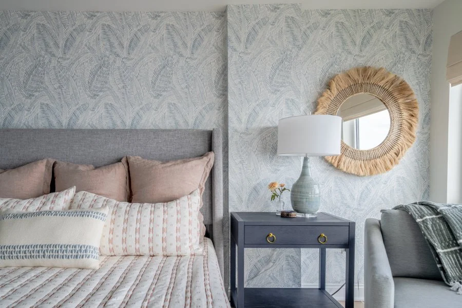
Serene & Spa-Like: My Favorite Calm and Tranquil Tones
If you’re drawn to soft, grounding hues that make your home feel like a retreat, here are a few of my go-tos:
Muted Greens & Eucalyptus Hues – Think soft sage or dusty olive. These nature-inspired shades bring instant calm.
SW Sea Salt – a cult favorite for a reason: soft, subtle, and incredibly calming
Alkemis Vispera (93) – a dusty eucalyptus that feels natural and grounding
Soft Blues & Blue-Grays – Dreamy sky blues and misty coastal tones create that spa-like vibe we all crave.
SW Silver Strand – the perfect blend of blue and gray for a restful, coastal tone
Alkemis Walking in the Rain (71) – dreamy and light, this one feels like a foggy morning sky
Warm Whites & Soft Beiges – Skip the stark whites. Creamier tones feel warm, welcoming, and layered.
SW Alabaster – warm, creamy, and timeless without ever feeling yellow
Alkemis Floating (11) – an inviting neutral that works in almost any space
Earthy Taupes & Light Mushroom Tones – Organic and timeless, these subtle neutrals add soft structure to a space.
SW Accessible Beige – warm but clean, a true classic
Alkemis Eespectro (17) – grounding and rich, with just enough depth to make a statement
Pro Tip: Use a sheet of printer paper to compare undertones—what looks white or green in the can may read differently once it's on the wall!
Coastal & Breezy: Fresh, Light, and Airy Colors
Want your space to feel bright and open, like a breath of fresh air? These colors never fail:
Crisp & Airy Whites
SW Pure White – clean without feeling stark, great for modern coastal spaces
Alkemis Natural Light – bright and breezy with just a touch of warmth
Soft Seafoam & Aqua Tones
SW Rainwashed – fresh and beachy with a refined edge
Alkemis Sea Mist – soft aqua with a whisper of gray undertone for balance
Warm Sand & Driftwood Neutrals
SW Shoji White – a creamy off-white with beige undertones
Alkemis Desert Air – muted and earthy with a subtle coastal influence
Sun-Washed Corals & Peachy Nudes
SW Likeable Sand – soft, rosy warmth without being too pink
Alkemis Rose Moon – barely-there blush that gives just a kiss of color
Pro Tip: Rooms with lots of natural light can handle cooler tones, while darker spaces benefit from warmer hues to keep them feeling cozy.

Feeling Stuck on Color? Here’s How to Choose Confidently
If you’ve ever stared at a wall of paint swatches and felt completely overwhelmed, you’re not alone. Here are a few of my favorite tricks to help you narrow it down with confidence:
Start with how you want the space to feel.
Calm and cocooning? Go for muted, warm tones. Bright and energizing? Stick with crisp, clean hues.
Test colors in real light.
Colors can shift dramatically from store lighting to natural light. I always recommend bringing home physical swatches—or better yet, ordering peel-and-stick samples from Samplize. Look at them throughout the day in both natural and artificial light.
Use a sheet of printer paper to spot undertones.
This is one of my favorite tricks. Hold a plain white sheet of paper next to the paint swatch to reveal the undertone. That “perfect white” might suddenly look pink, purple, or even green. The same goes for greens that read more gray once you get them home.
Think of your home as a whole.
Your paint color should complement your furnishings, wood tones, textiles, and overall style. A shade that looks great on a sample card may feel off once it’s up against your favorite sofa or stone countertop.
When in doubt, trust your gut—and don’t rush it. A few extra days of testing are worth avoiding years of regret.
🔗 Read the full article here.
Let’s Find Your Color StoryI loved sharing my thoughts in Apartment Therapy—and I’d love to help you find the perfect palette for your own space, too.

REBECCA MERRITT
founder & principal designer
We are a boutique interior design studio based in The Keys, Florida.